Last week the Texas Transportation Institute released the 2011 edition of its benchmark Urban Mobility Report. It is packed full of useful statistics about roadway networks, congestion, and public transit, though is not without its critics (see below). I’d like to highlight some of the more interesting findings out of this.
The Value of Transit
One of the values TTI estimates is the number of additional hours of delay each peak hour commuter would incur annual if public transportation were discontinued. In effect, this is one key benefit to motorists of public transport. Here are the top 10 cities:
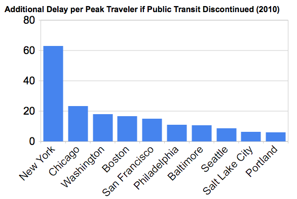
To further show the value of transit to New Yorkers, let’s do a quick back of the envelope type calculation for illustrative purposes. The median household income in metro New York is $61,927. If each home with an auto commuter in it has one and only one commuter who obtains the average benefit, and incomes of auto commuters follow the overall, then this auto benefit is equivalent to 1.66% of income. You can think of it as sort of like a 1.5 percentage point cut in the income tax rate for those households, just based on the value delivered to them.
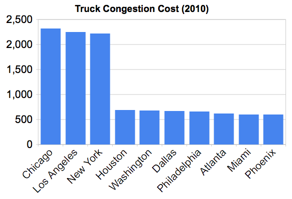
Now of course those households probably make contributions towards transit through taxes and otherwise, but clearly they are also getting a return even if they don’t ever ride transit personally. Also, this considers only peak period commuters, not non-peak drivers (who also experience significant delay in New York) or the value of transit to commercial vehicles, which is likely big as well given than NYC incurs over $2 billion in cost due to trucking delays from congestion.
After NYC, the savings drop off rapidly, but there are six additional cities with more than 10 hours of delay savings per peak commuter, so they probably get something material out of it.
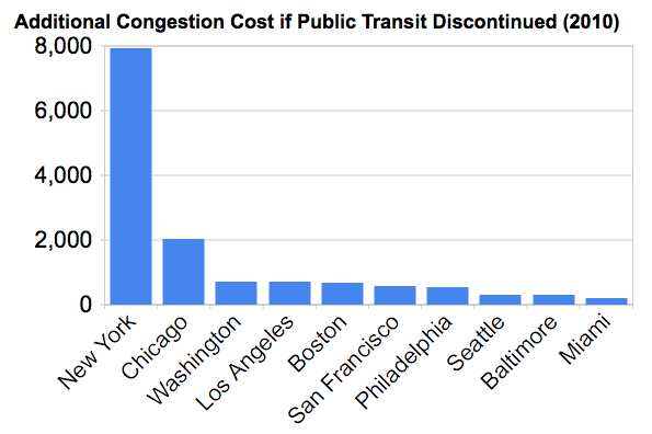
On an aggregate basis, the total value of congestion avoided as a result of public transit is impressively high as well, as this look at the top ten cities shows (in millions of dollars):
Commercial Vehicle Traffic
TTI has also started trying to break out the cost of delays to commercial vehicles. Here are the top ten cities for trucking congestion delays, in millions of dollars:
Lane Miles
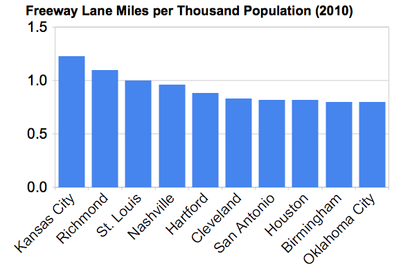
When looking at congestion, I think it’s also relevant to consider the size of the roadway network relative to the population. TTI reports freeway and arterial lane miles, so we can do this calculation. Here are the top ten cities for freeway lane miles per capita, for metro areas greater than one million people.*
Here are the bottom ten:
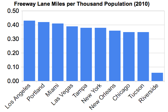
Note: Riverside has a likely data error in the master TTI spreadsheet the artificially lowers its score here.
TTI and Its Critics
I could do a lot more on the TTI report, and maybe I will in future posts, but I wanted to address the notion that TTI’s measures have been “debunked” as some have said.
The root of this goes back to a CEOs for Cities report called “Driven Apart” that basically says that TTI and the way they measure things are wrong, and that different measures would be more appropriate.
I doubt most of those who link to that report approvingly have ever read what it says in detail. I’ll freely admit I haven’t either. But having looked at previous work Joe Cortright did, I’m confident it’s technically sound.
Regardless, I think that this is never going to gain mind share with the greater public, and that only the hard core urbanist true believes are going to be impressed with it.
Let me explain why in contrast to the extremely successful CEOs for Cities “Talent Dividend” research which shows the size of the prize for increasing educational attainment. Firstly, in education there is already unanimous consensus that we need to raise education attainment, even if there are debates about getting there. So this is preaching to the crowd. Second, the idea that raising educational attainment boosts incomes its intuitively obvious because in our everyday experience, the people we interact with on a daily basis who have more education tend to make more money. And the causal link is clear. The Talent Dividend merely takes this everyday experience and makes it real at the macro level, showing the size of the prize. Also, its policy prescription of shooting for a one percentage point increase in college degree attainment is intuitively achievable.
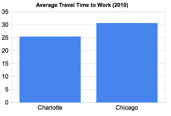
Now contrast this with Driven Apart. Here we have low consensus about what we want to achieve. Additionally, the notion that places like Chicago are somehow better than Charlotte for drivers is counter-intuitive and flies in the face of the everyday experience of Chicagoans.
I am inclined to be pro-urban and pro-transit. But I’ve commuted in Chicago and can tell you that traffic is simply horrific. Complaining about traffic and the CTA are two of the most common Chicago pastimes. Not only that, traffic has been getting worse over the years. This is not just commuting. Expressways like the Kennedy and Eisenhower are now basically backed up all day. Even on a Saturday or Sunday, traffic frequently grinds to a halt. As near as I can tell, the ramp from the inbound Ryan to the outbound Ike is backed up effectively 24 hours a day. The numerous six way intersections like Belmont/Lincoln/Ashland and Fullerton/Damen/Elston make driving around the city a chore as you sit through multiple lights. (And hope you don’t have to turn left).
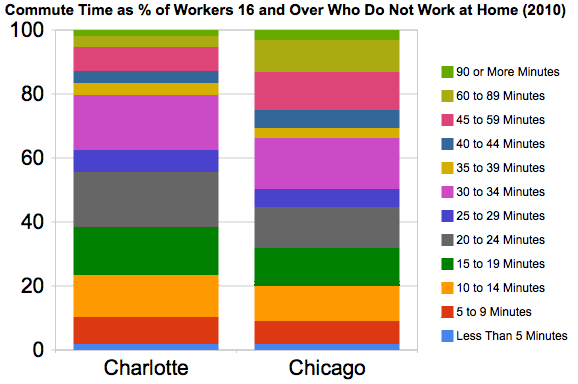
Now the Driven Apart report doesn’t deny this, but simply suggests that’s the wrong way to look at it. Rather, we need to consider distance, etc. and that it’s the total time driving that counts. Here’s the chart comparing Chicago and Charlotte:

Driven Apart suggest that the real culprit we should be looking at is sprawl. I agree that’s a key problem. However, Chicago is one of the most sprawling regions in the US. Indeed, that’s one reason it’s traffic is so bad. This has been tirelessly documented by the Center for Neighborhood Technology and others. Talk to any urbanist planning group in Chicago, and restraining sprawl is a top priority. As I noted in my census coverage, virtually all Chicago growth in this stagnant region has been in the exurban areas. The region seems to actively promote this, with items such as extended Metra service to Elburn and a planned $69 million interchange expansion at I-90 and Route 47 in exurban Huntley. The sprawl has even spread into Rockford, whose metro area is seeing a big influx of people from Chicago despite its depressed economic state.
Beyond sprawl, Chicago also has the third lowest freeway lane miles per capita of any metro area in the US greater than one million people, though it does better when looking at arterial lane-miles.
So whatever the merits of Driven Apart (and I’m not claiming any of it is per se wrong), implying something like Chicago is better than Charlotte for drivers falls into the category of “extraordinary claims require extraordinary proof.” Something that is effectively a technical argument is never going to sell, particularly when it flies in the face of the everyday experience of people who live in these cities. I know both Chicago and Indy (another city cited for its sprawly commutes in the Driven Apart study) intimately from a driver’s perspective, and there’s simply no comparison. In terms of getting places, Indy is just indisputably better to me. I don’t think I could ever be convinced to think otherwise.
Given this, I think the idea that traditional measure of congestion are going to be dethroned is a long shot at best.
* Note that TTI urban areas are not metro areas but a bespoke region. The population used for thresholding which regions to include was the Census population of the metro area, but the population value used for per capita calculation was the population of the TTI region as reported by TTI.
Please put units on your graphs. I assume the delay in the first graph is minutes/commute, but you need to explicitly say that.
Craig, the unit in the first graph is hours per driver per year.
Aaron, what you’re saying about freeway lane-miles per capita is confusing correlation with causation. Congestion per capita (as well as travel time to work) is a strong correlate of size; freeway lane-miles per capita are an inverse correlate of size, and this is especially true when you properly consider the Inland Empire to be part of Los Angeles. Both of those follow from simple network effects of cities – larger size means less infrastructure per capita, but also more congestion. The one city that violates this pattern for freeway lane-miles per capita, Houston, ranks fourth in per capita congestion costs.
Between 2000 and 2010, among top 10 metros, Chicago gained more population, in percentage terms, than New York, L.A. or Boston. Chicago’s city-center grew at faster rate than Austin’s metro. Kendall county was the fastest growing county in the U.S.
If the goal is to call Chicago “stagnant” you can find a metric to support the term. It’s just not intellectually honest to use “growth” as the important metric when comparing Chicago to smaller, sub-urban areas like Houston, but to ignore growth when comparing Chicago to capital-rich tech-hubs like Boston and San Francisco.
Of the 15 largest municipalities in the United States, Chicago was the only one that lost population during the last census period.
Of the 15 largest counties in the United States, Cook County was only two that lost population during the last census period. Wayne County, MI (Detroit) is the other.
Out of 51 metro areas with greater than one million people, Chicagoland ranked #40 in total percentage growth in the last census period. (LA, New York, and Boston were indeed other laggards). This was less than half the US growth rate.
Essentially all growth was in the exurbs. The high showing by Kendell County simply shows an example of the massive sprawl in the region.
No question that Kendall county is sprawl. And it sucks. The point is that if you look to Dallas or Houston or Austin as examples of “non-stagnant” cities, nearly all of their growth is sprawlier, like Chicago’s exurbs without the development around Metro stops. So, which is it? Is low-growth New York or Boston good, because Chicago’s core looks a lot like that? Or is Houston and San Antonio good? Because Chicago’s metro looks a lot like those cities. Or is it simply too complex of an analysis to call a huge, old megalopolis “stagnant” and really have it mean very much? You could just as easily call Chicago “flexible” or “solid” with the same data. I’m not saying that either term is apt. I’m saying that it’s a value judgment, not analysis, that is not constructive.
Great, informative post overall, by the way.
An impressive and thought provoking analysis Urbanophile. You show how cities in the different regions of the U.S. really are different models of development despite seeming superficial strategies. They really are following their own paths and discussions about cities learning from each other seem less useful when the profound nature differences in form, function, and social arrangements emerge from analysis such as this.
Interesting information, there is a lot to digest here. However I can’t help but nitpick. First, I’d like to challenge the assumption that Chicago is the sprawliest city around. Having lived in metro Detroit I find its sprawl to be bigger and more pernicious in relative terms. It is my understanding that Atlanta is almost entirely sprawl.
Second you seem to be criticizing the Metra expansion, but isn’t that simply a way to effectively fight congestion?
Chicago traffic is no joke, but we should be careful to not make false correlations and look at the region with nuance.
I doubt is there’s any way to adequately measure this, but there’s the experience of mobility in places, and that experience can be happy in one place and frustrating in another. A lot of the things that make the experience good or bad are not directly measurable in minutes and miles.
Take Vancouver, for example, the golden child of the planning world. (Toronto was 30 years ago.) Distances are relatively close in Vancouver, and the driving times are not bad, but it is a very frustrating place to drive. Why? Because there is almost no left turn arrows there. A very American invention that these Canadians will not take to heart. The lack of left-turn arrows means that it can sometimes take three lights to get through and make a turn on an intersection. The back-ups behind one person waiting to make a turn effectively rid the city of lane capacity. Maybe the planners want to discourage driving, but why not do so by simply “adding back” the capacity with better traffic management devices, and then up the gas tax rate?
It’s these little improvements that have so been missing from good urban management. Fortunately or unfortunately, we are in a time when there’s simply not a lot of money for the big fixes (like by-passes, tollways and rail lines) that people think will sweep away or forestall the problems. This may get people to look at managing better what we have. Obviously if the problems are big, the price tag for fixing them will be as well, but I suspect that there are a number of small things that in combination could deliver good results. The trick is to begin making them, and to get in the habit of looking.
Nitpick of the TTI data: the numbers for Riverside are wrong. If you look carefully in the table, you’ll see the total number of freeway lane-miles is 1,115 for several years, but then jumps down to 115 and 116 for the last two years. This is a typo.
One thing raw numbers on length of commute don’t capture but which is significant to the lived experience and stress of commuting is the difference between bumper to bumper stop-and-go commuting versus breezing down the road at a faster, more or less constant, and predictable pace. Advancements in the robotization of cars may change this in the coming years, but for now this is something which makes places like Indy noticeably less of a chore to drive than Chicago.
Thumbs up on your point about scheduling in extra time buffers when commuting in Chicago.
By the way, Rod, going off-topic here, but there’s a very good reason not to have left turn arrows: they frustrate pedestrians. I’ll happily cross six lanes of traffic at once in Manhattan, where the traffic lights have a simple two-phase cycle. But I’ll grumble at crossing two or three at a time in Tel Aviv, London, and other cities that require a pedestrian to cross in two cycles, one for each half of the street, in order to give cars conflict-free turn cycles.
@Rod Stevens,
I don’t know beans about Canadian or BC politics, but may I suggest and inquire that if it’s anything like American gasoline politics, perhaps raising the gasoline tax in Vancouver is politically untenable whereas inhibiting car use by tweaking the traffic engineering and road design is politically feasible because those decisions are more insulated from the ballot box and less transparent to the average voter?
Alon, nice catch. That quirk in the data for Riverside-San Bernardino is present in the TTI master spreadsheet. I may follow up with them to see if they’ll issue a correction.
I should also note that as of the 2010 Census, Tuscon doesn’t have a population of one million. My thresholding was based on estimates data.
What I get from the comparison of Charlotte to Chicago is:
It is indeed faster to drive to work in Chicago.
People in Chicago often take public transit to work.
Public transit commutes are remarkably long on average.
But overall, not as stressful as driving.
So driving is better in Chicago, as you can see from the Driven Apart data. But only because many people don’t drive, as you can see from the Census data.
“No question that Kendall county is sprawl. And it sucks. The point is that if you look to Dallas or Houston or Austin as examples of “non-stagnant” cities, nearly all of their growth is sprawlier, like Chicago’s exurbs without the development around Metro stops. So, which is it? Is low-growth New York or Boston good, because Chicago’s core looks a lot like that? Or is Houston and San Antonio good? Because Chicago’s metro looks a lot like those cities. Or is it simply too complex of an analysis to call a huge, old megalopolis “stagnant” and really have it mean very much? You could just as easily call Chicago “flexible” or “solid” with the same data. I’m not saying that either term is apt. I’m saying that it’s a value judgment, not analysis, that is not constructive.”
This
Chicago wasn’t the only one of the largest cities that lost population … you mention the “top 15” … but keep in mind that Detroit was knocked out of the “top 15” from the last census due to the plunge in population. they went from 10th or 11th place to 18th.
For additional critiques of the Urban Mobility Report see my Planetizen column “Faulty Assumptions In The TTI Urban Mobility Report” (http://www.planetizen.com/node/51680 ) and my report, “Smart Congestion Relief: Comprehensive Analysis Of Traffic Congestion Costs and Congestion Reduction Benefits” (www.vtpi.org/cong_relief.pdf ).
It is important to clearly indicate the denominator when evaluating congestion costs. TTI (and your own comments about the difficulties of commuting by car in Chicago) tend to measure congestion costs per peak-period automobile user, which ignores the congestion avoided by commuters who use alternative modes. For most applications a better measure is per capita congestion costs, which does account for the full congestion reduction benefits of high quality transit. For example, cities such as Chicago and New York may have more INTENSE congestion – delay per peak-period vehicle-mile – but high quality public transit reduces the amount that residents must drive during peak-periods, and more compact land use patterns reduces average trip distance, so their total annual congestion costs are lower overall.
Todd, three things about your critique, in descending order of importance:
1. The TTI itself has been using the travel time index less and less in the last 10 years. Its headline figures are hours lost, fuel wasted, and congestion cost, respectively, and the denominator is not passenger-miles but the number of car commuters. It’s not a marginal figure for the externality, but neither is anything Driven Apart comes up with.
2. For an estimate of the congestion externality, the best baseline is freeflow traffic. LOS C is a good baseline for what people should design roads for, on the grounds that the marginal benefit of going to A doesn’t justify the extra cost.
3. Please, please, please do not use Delucchi’s estimate for climate change damages. First, the original research was done in 1991, when people didn’t realize how bad the problem was. And second, Delucchi only looks at damages to the US. Since I don’t think part of transportation policy should be to declare war on Bangladesh, Nigeria, and other vulnerable country, the most appropriate thing is to use global damage estimates, and those can be much higher. A bunch of climatologists and economists say $110/ton; E3 recently published a study suggesting $500/ton.
Thanks for your comments, Alon.
Yes, TTI uses other indicators besides travel time index, but most of their analyses still measure delay or cost per peak-period motorist (what they call “commuters”), not per capita, and so it does not reflect the congestion avoided if improvements to alternative modes reduce total per capita peak-period vehicle trips. They only recognize the congestion reduction that public transit provides to motorists, not to transit travelers themselves.
Many transport economists criticize use of freeflow travel as a baseline, including the recent study by Transport Canada, and previous studies by Lee and Delucchi. Basing congestion costs on freeflow exaggerates monetized congestion costs beyond what is economically optimal.
My analysis uses Delucchi’s estimate of congestion costs, not his estimate of climate change damages. I suggest that you read my paper more carefully.
Just a comment about driving in Chicago. From Western Ave. east to the lake, it is apparent to me that the streets are just too thin for the amount of auto traffic. Much of Chicaog just wasn’t designed for the car. That gives Chicago much of its charm, but makes it more of a challenge to drive in.
Todd,
Yes, the TTI measures the benefits of transit to motorists alone. That it’s guilty of. But the mainline congestion cost is exactly the externality to other drivers. It’s especially important if you plan to congestion-charge: the cost should be imputed per driver (or VMT, or car, or whatever) rather than per person, since people who aren’t causing congestion should not have to pay for it.
I agree it’s pointless to build or congestion-charge to LOS A, but there’s a difference between saying that a certain baseline level of congestion is not a problem and saying that it doesn’t exist. The best analogy I can come up with is crowding on trains. On peak-hour trains, there’s a certain standing-to-seated ratio beyond with it’s pointless to add more service – say, one standee per seated person. But if due to crowding there are three standees per seated person, just saying it’s twice the baseline doesn’t quite capture how crowded it is for standees. In both cases, the extra cars/passengers beyond the baseline make the situation more crowded not just for themselves but also for cars/passengers that don’t saturate the baseline.
I stand corrected on the GHG numbers (although $40/ton is still low in light of recent estimates of climate change damages). I was thinking about a different VTPI study that did reference Delucchi on everything and came up with about $10/ton. Sorry.
@Joel:
Many of them are also too thin for transit–depending on how bad rush hour looks, I’ll walk from my apartment (near Ashland and North) to North/Clybourn or Armitage in Lincoln Park to catch the L instead of taking the bus. IIRC, Chicago and Belmont Avenues’ bus routes have the highest ridership density of the east-west routes on the north side (during peak periods Chicago might even be the most frequent in the system), but neither was included in the MPC’s BRT plan because neither street was wide enough to accommodate transit lanes without undue disruption to traffic.
Re: Chicago Interstates.
Look at a map of the Chicago area in any road atlas. There are three major east-west interstates that must avoid Lake Michigan, I-80, I-90 and I-94. There are three north-south interstates that end at or near Lake Michigan, I-65, I-57 and I-55. Much of all this traffic must pass through the dense intercity core of the city on a highway system designed in the early-50s and constrained by the urban landscape it passes through. Yes, one can avoid this mess but the alternatives are all tollroads!
Maybe it’s time to free the Chicago Six…